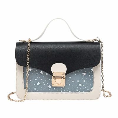

Waterproof Sandproof Beach Tote Bag for Women - Large Zippered Pool Bag with Wet Pocket - Perfect for Gym, Grocery Shopping, Travel & Beach Outings
Delivery & Return:Free shipping on all orders over $50
Estimated Delivery:7-15 days international
People:29 people viewing this product right now!
Easy Returns:Enjoy hassle-free returns within 30 days!
Payment:Secure checkout
SKU:34510287
Product Description
From the brand /* * Used when device = desktop * Configured in: configuration/brazil-config/global/brand-story.cfg */ /* Because the carousel is implemented as an ol list, any lists in the card text will have a secondary list style (letters). This will give an incorrect appearance to viewers, so we set all lists to the primary list style (numbers). */ .aplus-brand-story-card ol li { list-style: decimal; } /* Top level containers */ .aplus-module .apm-brand-story-hero { -moz-box-sizing: border-box; -webkit-box-sizing: border-box; box-sizing: border-box; width: 1464px; height: 625px; background-color: #fff; } .aplus-module .apm-brand-story-card { -moz-box-sizing: border-box; -webkit-box-sizing: border-box; box-sizing: border-box; width: 362px; height: 453px; background-color: #fff; } .apm-brand-story-hero, .apm-brand-story-card { -moz-box-sizing: border-box; -webkit-box-sizing: border-box; box-sizing: border-box; position: relative; width: 100%; height: 100%; float: none; } .aplus-module.brand-story-card-1-four-asin .apm-brand-story-card { /* Only 12px to account for image cell border */ padding: 12px; } /* Full background image (Hero 1 & Card 2) */ .aplus-module .apm-brand-story-background-image { -moz-box-sizing: border-box; -webkit-box-sizing: border-box; box-sizing: border-box; overflow: hidden; position: absolute; width: 100%; height: 100%; } /* Card 1 small images */ .aplus-module .apm-brand-story-image-row { -moz-box-sizing: border-box; -webkit-box-sizing: border-box; box-sizing: border-box; height: 185px; padding: 0px; margin: auto; display: flex; } .aplus-module .apm-brand-story-image-row .apm-brand-story-image-cell { /* Use content-box to ensure image size matches editor schema */ -moz-box-sizing: content-box; -webkit-box-sizing: content-box; box-sizing: content-box; padding: 0px; margin: 0px; width: 166px; border: 1px solid #fff; } .aplus-module .apm-brand-story-image-row .apm-brand-story-image-cell .apm-brand-story-image-link { display: block; width: 100%; height: 100%; } .aplus-module .apm-brand-story-image-row .apm-brand-story-image-cell .apm-brand-story-image-link .apm-brand-story-image-img { display: block; width: 100%; height: 100%; object-fit: cover; } /* Card 3 logo image */ .aplus-module .apm-brand-story-logo-image { -moz-box-sizing: content-box; -webkit-box-sizing: content-box; box-sizing: content-box; height: 145px; margin: 0px 4px; padding: 20px; padding-bottom: 0px; } /* Text overlays */ .aplus-module .apm-brand-story-text-bottom { -moz-box-sizing: border-box; -webkit-box-sizing: border-box; box-sizing: border-box; position: absolute; bottom: 13px; left: 13px; } .aplus-module .apm-brand-story-hero .apm-brand-story-text-bottom { background-color: rgba(0,0,0,0.6); color: #fff; padding: 13px 65px 13px 13px; /* accounts for overlap of first card */ width: 437px; } .aplus-module.brand-story-card-2-media-asset .apm-brand-story-text-bottom { background-color: rgba(255,255,255,0.6); color: #000; padding: 13px; width: 336px; } .aplus-module.brand-story-card-1-four-asin .apm-brand-story-text { margin-top: 8px; } .aplus-module.brand-story-card-1-four-asin .apm-brand-story-text.apm-brand-story-text-single { margin-top: 20px; } .aplus-module.brand-story-card-1-four-asin .apm-brand-story-text h3 { white-space: nowrap; overflow: hidden; text-overflow: ellipsis; } .aplus-module .apm-brand-story-slogan-text { -moz-box-sizing: content-box; -webkit-box-sizing: content-box; box-sizing: content-box; margin: 0px 4px; padding: 20px; } .aplus-module .apm-brand-story-faq { -moz-box-sizing: content-box; -webkit-box-sizing: content-box; box-sizing: content-box; padding-top: 10px; } .aplus-module .apm-brand-story-faq-block { margin: 0px 10px; padding: 10px; } .aplus-v2 .apm-brand-story-carousel-container { position: relative; } .aplus-v2 .apm-brand-story-carousel-hero-container, .aplus-v2 .apm-brand-story-carousel-hero-container > div { position: absolute; width: 100%; } /* Ensuring the carousel takes only the space it needs. The sizes need to be set again on the absolutely positioned elements so they can take up space. */ .aplus-v2 .apm-brand-story-carousel-container, .aplus-v2 .apm-brand-story-carousel-hero-container { height: 625px; width: calc(100% + 15px); max-width: 1464px; margin-left: auto; margin-right: auto; } /* This centers the carousel vertically on top of the hero image container and after the logo area (125px). Margin-top = (heroHeight - cardHeight - logoAreaHeight) / 2 + logoAreaHeight */ .aplus-v2 .apm-brand-story-carousel .a-carousel-row-inner{ margin-top: 149px; } /* Cards need to have a width set, otherwise they default to 50px or so. All cards must have the same width. The carousel will resize itself so all cards take the width of the largest card. The left margin is for leaving a space between each card. */ .aplus-v2 .apm-brand-story-carousel .a-carousel-card { width: 362px; margin-left: 30px !important; } /* styling the navigation buttons so they are taller, flush with the sides, and have a clean white background */ .aplus-v2 .apm-brand-story-carousel .a-carousel-col.a-carousel-left, .aplus-v2 .apm-brand-story-carousel .a-carousel-col.a-carousel-right { padding: 0px; } .aplus-v2 .apm-brand-story-carousel .a-carousel-col.a-carousel-left .a-button-image, .aplus-v2 .apm-brand-story-carousel .a-carousel-col.a-carousel-right .a-button-image { border: none; margin: 0px; } .aplus-v2 .apm-brand-story-carousel .a-carousel-col.a-carousel-left .a-button-image .a-button-inner, .aplus-v2 .apm-brand-story-carousel .a-carousel-col.a-carousel-right .a-button-image .a-button-inner { background: #fff; padding: 20px 6px; } .aplus-v2 .apm-brand-story-carousel .a-carousel-col.a-carousel-left .a-button-image .a-button-inner { border-radius: 0px 4px 4px 0px; } .aplus-v2 .apm-brand-story-carousel .a-carousel-col.a-carousel-right .a-button-image .a-button-inner { border-radius: 4px 0px 0px 4px; } LEDAOU Beach Bag MORE CHOICE MORE ENJOYMENT Previous page LEDAOU Beach Bag Visit the Store Weekend Overnight Carry On Bag Visit the Store Next page
Product Features
Polyester
China
Polyester lining
Zipper closure
Hand Wash Only
Beach Tote Bag feature a zipper closure to keep your necessities secure, while round handles make for easy carrying.With 8 inch drop handles this bag can be held by hand or on your shoulder for ease of comfort!
Large Beach Bag with 7 Pockets: 17.5*15.7*8, with 45 L capacity, the big main compartment can fit all the essentials for your family (3-4 families member), like change of clothes, sandals, beach towels, swimsuit, water bottles, still can utilize the 4 pockets outside and 2 inner pockets for extra essentials (water bottles, sand toy, snacks, sun glasses etc.)
Wet Pocket: Unlike other beach tote bag, this one is up-graded with separate waterproof wet compartment which you can put into some wet stuff Toiletries, wet swimsuit and towels, keep other items dry all the day.
Sandproof Beach Bag : This beach tote features high density polyester, which is sandproof, easy to clean, sand shakes right off instead of carrying it home with you.
Tote Bag with Zipper perfect for carrying when you step out for beach, travel, weekender, swimming, pool, gym, s hopping, picnic since it folded up small and lightweight, can be tucked in your backpack or luggage case easily. Also a good choice for reusable grocery tote, diaper bag, carry-on bag, travel bag, storage bag, really a super practical beach bag for women, grab one of them, it will not let you down.


